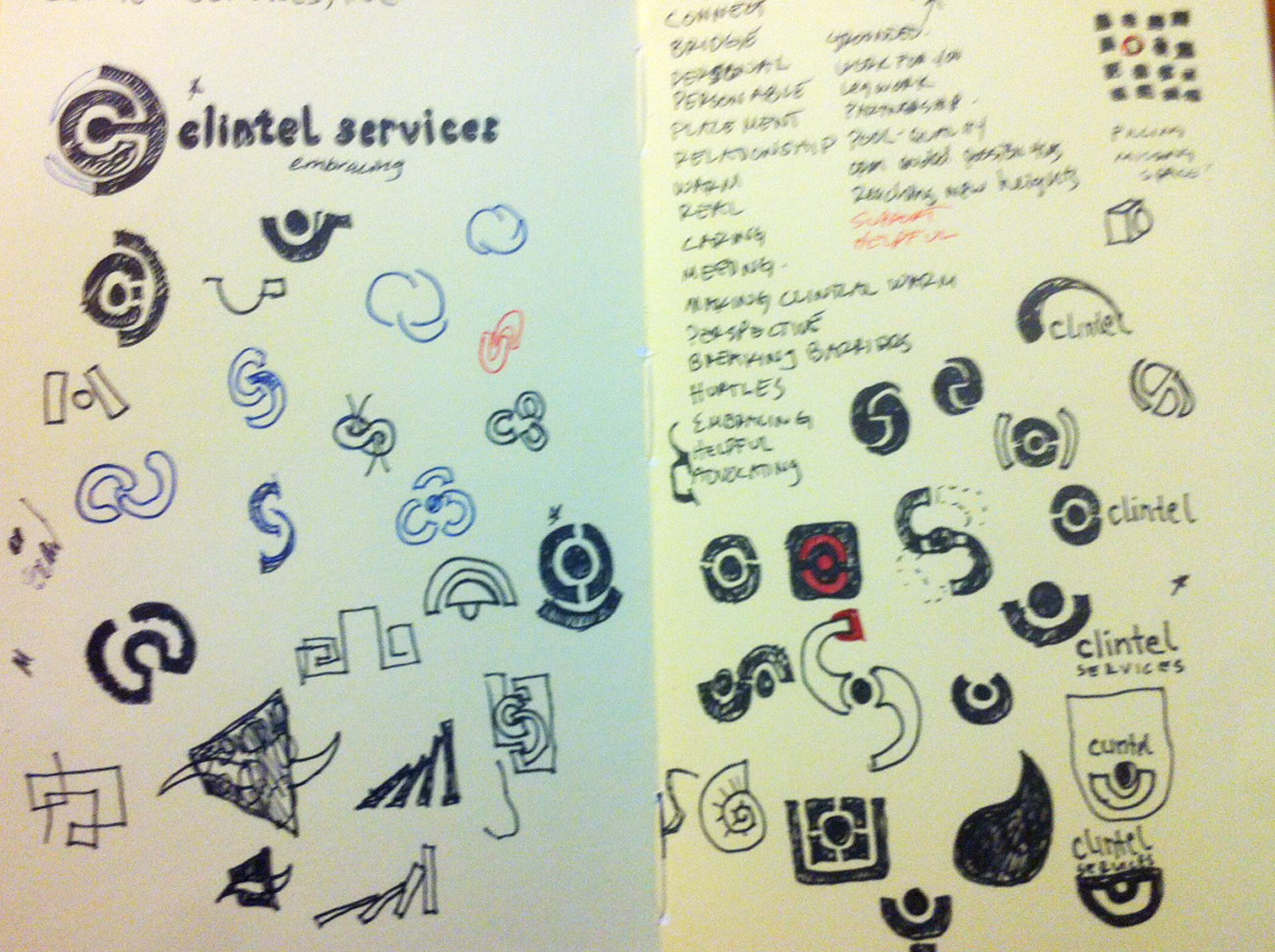
This post was going to start out as a Sketchbook Bingo post but since the page I turned to in one of my sketchbooks were concept sketches for a past project, I decided to quickly show the process of concepting, sketching, word mapping and refinement, etc. to final refined design.
This was an identity project I did a couple years ago for a recruitment firm. You can see the word mapping I used to generate ideas, and several sketches, as well as the one sketch that went on to be refined as the final. This particular logo was one of a few I presented, and while this direction wasn’t chosen, I thought it represented the company and its core values quite nicely. The logo that was chosen is here.
Below is the grouping of initial word mapping and and some icon sketches.
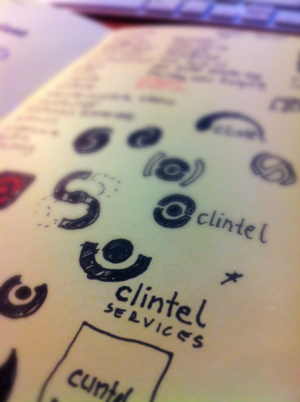
A little refinement in the sketches.
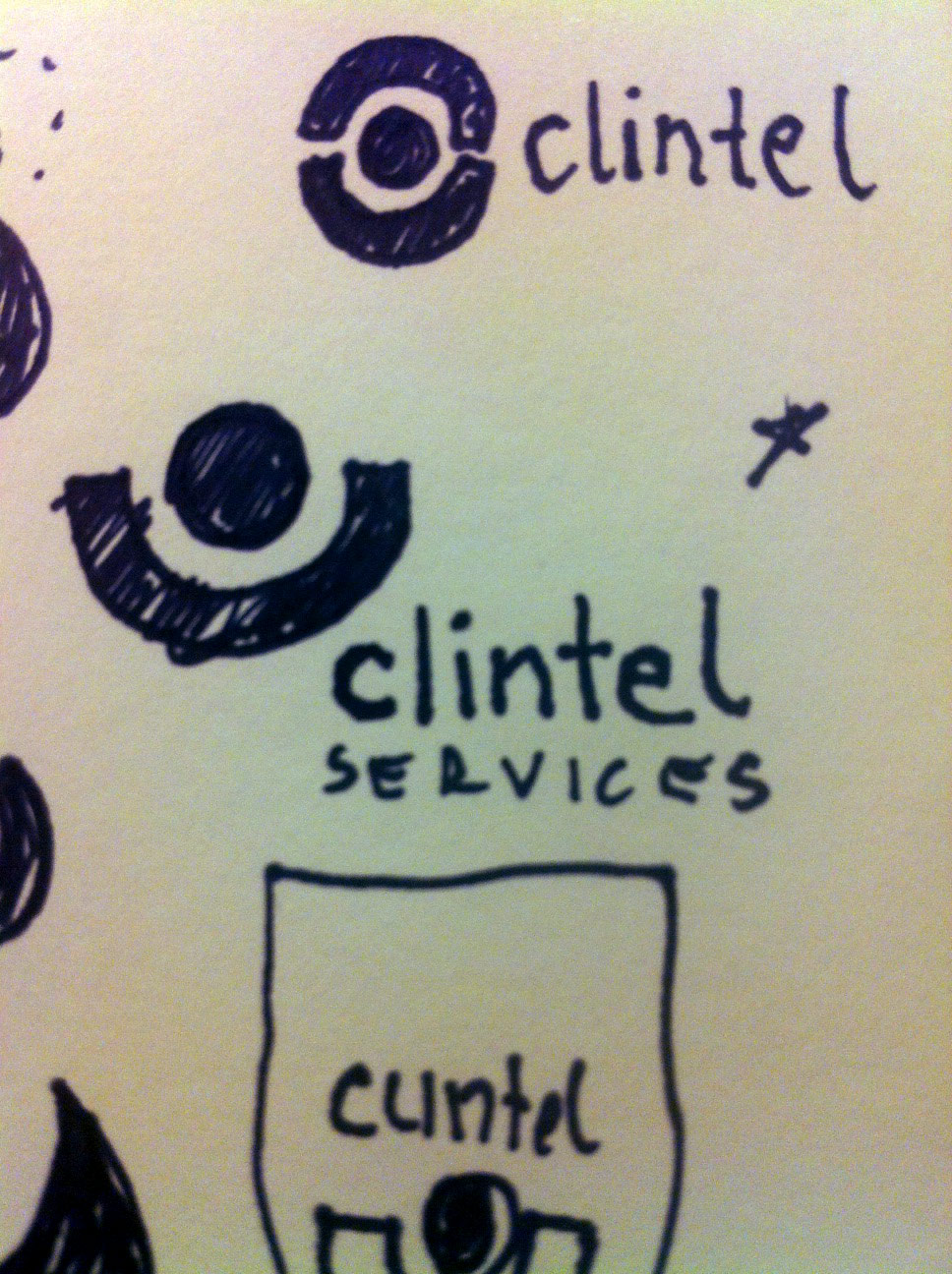
This is the concept I wanted to refine.
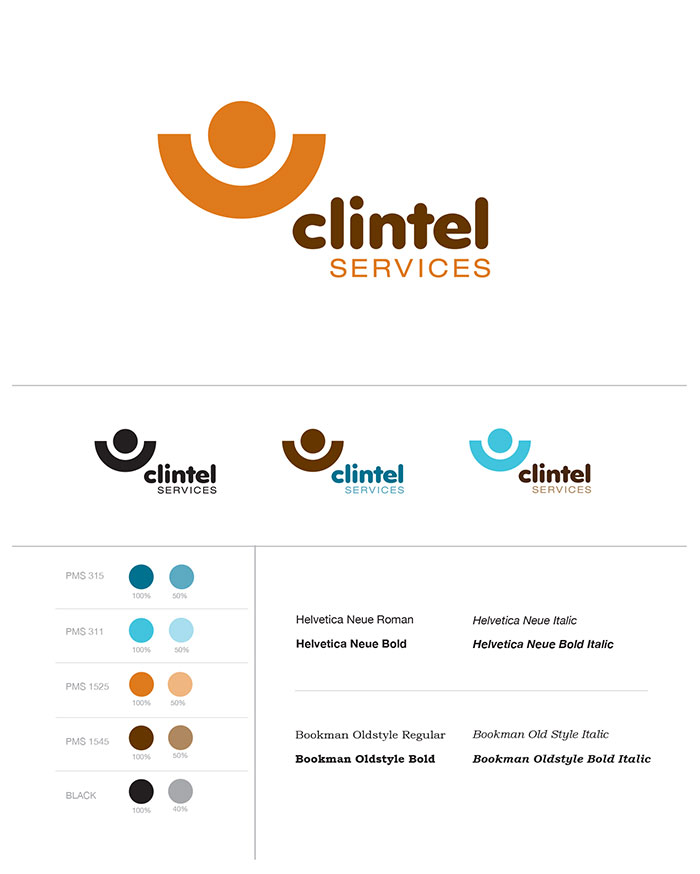
PRESTO CHANGO! The refined design.
Logo Guide and color/font options.
Badges and Icons.
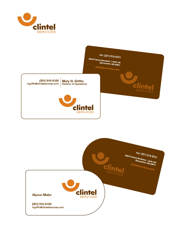
Business card design options.
This is a simplified look to what goes into an identity design. There is a lot more research, Concepting, more research, client meetings, more research, and more design involved to arrive at the final design.
Have been through an identity/logo design/re-design? What were your experiences?
If you have any questions regarding an identity design, email me at info[at] sesko.com or comment below.

