You may have designed your logo yourself in PowerPoint or used an online logo site to have your design created. Or, you may have even had a professional Identity designer create your logo/identity for you (kudos to you). While I am not a big fan of the first 2 options, the reality is that however you get your logo/identity made, it is often up to you to make sure it is used properly and I find a lot of businesses fail at that.
Even if your logo/identity is sub par, by implementing some of these tips, you can most definitely improve upon what you have and how it is perceived. See how many of these tips you already implement. The more you can check “yes” to, the better chances are your identity will be more successful.
- Make sure logo is in a high-resolution format. This will ensure that your logo looks crisp when used in printed materials, as well as look just as good in online or screen-based applications.
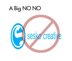
- Make sure you do not distort your logo.That means don’t stretch your logo to fit a specific space. Make sure you always scale your logo proportionately. This gives an unprofessional feel to your materials and might chip away at your credibility.
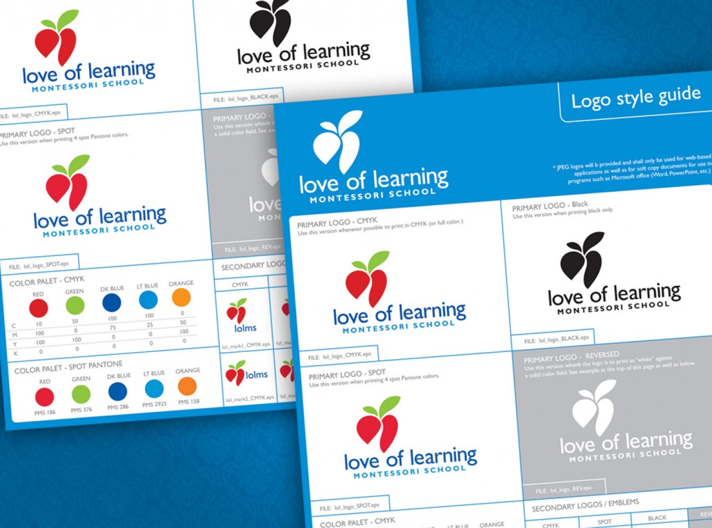
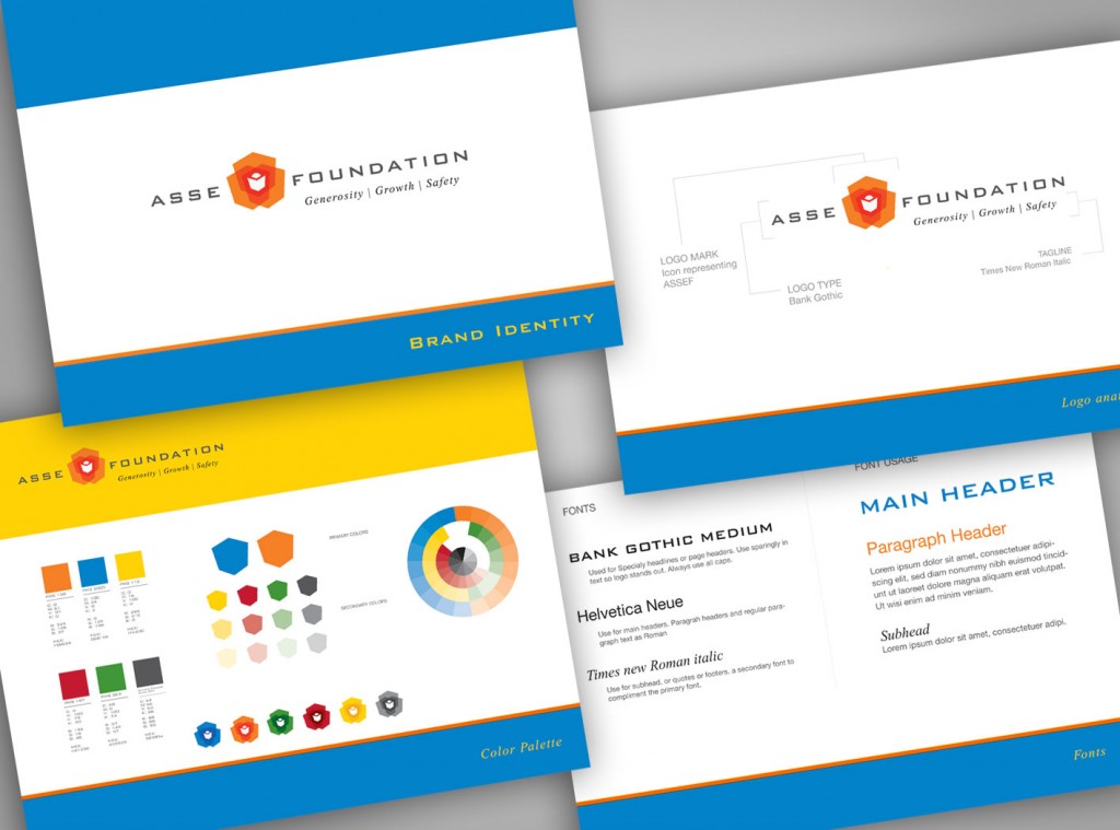
- Make sure you are using the same colors throughout all of your marketing materials. You should have certain colors specified for your identity (either process builds –C,M,Y,K; Pantone colors; RGB builds; or Hexadecimal values, and others). These values are specific to their mediums and should ALWAYS be used. This will ensure consistency across all mediums. (this is where a simple identity guide comes in handy-see figure above for a simple one page example and just below for a more comprehensive guide). This is not to say that you cannot use other colors, but the core identity colors should always be the same.

- Never alter your logo in any way. That includes changing the color or the orientation of its components. While there may be some exceptions to this rule, when in doubt, don’t mess with it. Again, this boils down to consistency.
- This also applies to fonts. Even if you had your logo done on the cheap and didn’t have fonts specified, just pick a couple main fonts and use them all the time, everywhere. This may seem anal to some, but consistency is usually recognized on a subconscious level by your customers or prospects. They are most likely NOT going to say “hey they used a different font there”. However, they will get the sense that something is up if the fonts and colors are all over the place.
- If you are using a logo or photo as an avatar, use the same one everywhere. On your Twitter, Facebook, linked-in, etc. Again. It is all about consistency and building a look and feel for your self/company that people will come to recognize and ultimately trust.
- Business just isn’t done anymore with out email. Make sure you have your logo or at least a nice signature at the bottom of every email. Make sure you name, number, email, address, website, Twitter, Facebook, linked-in, etc. are on every email. It may seem like over kill, but people rely on that information more that you think. It can be frustrating if it isn’t there and then you find yourself fishing for it.
- If you have business cards, and or stationary, make sure to use it in all correspondence. If you mail proposals out to people via snail mail, include a business card. Same with invoices. Have stickers made up and include one. Even if it is every time. People will hand them out to others. Also, ALWAYS have business cards on you. You never know when you will meet someone who could have a huge impact on your business.
These are just a few DIY tips that you can take action now with to improve how your identity is perceived. This doesn’t happen over night, but with a high level of consistency, over time you will start to be viewed with more credibility and respect to your customers and prospects.
Do you have any other DIY tips you use? Let us know.

