Overview
Love of Learning Montessori School is an independent school that provides Montessori education for students from infant/toddler through 6th grade. In 2008/2009 the school celebrated its 25th anniversary and felt it was the right time to take the school to the next level to increase enrollment and to foster an even greater relationship between the school and its community of families.
Challenge
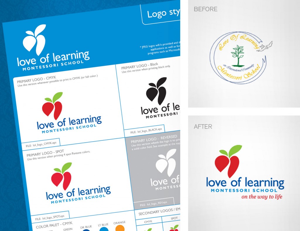
Love of learning Montessori School was looking to revamp its image to more accurately represent its mission and philosophy and give the school a more unified & credible presence. Previously, their logo was very hard to read and was dated. Their print materials and website had no consistency and this translated into an unorganized and unprofessional presence. The school’s image didn’t fall in line with the quality of the education they provide.
The challenge was to bring the school visual identity up to par with the quality of education they provide. This would in turn get more prospective families to come in for tours and interviews. Once they were in the door, the educational program sold itself.
Solution
- The logo design was based on symbolism that represents pathways/journeys, growth, love of learning, fundamentals, and individuality. Along with the logo came the new tagline that supported it: “On the way to life”. The logo coupled with the tagline really captures what the school is all about—its philosophy and mission.
- A primary color pallet was used to imply the importance of fundamentals.
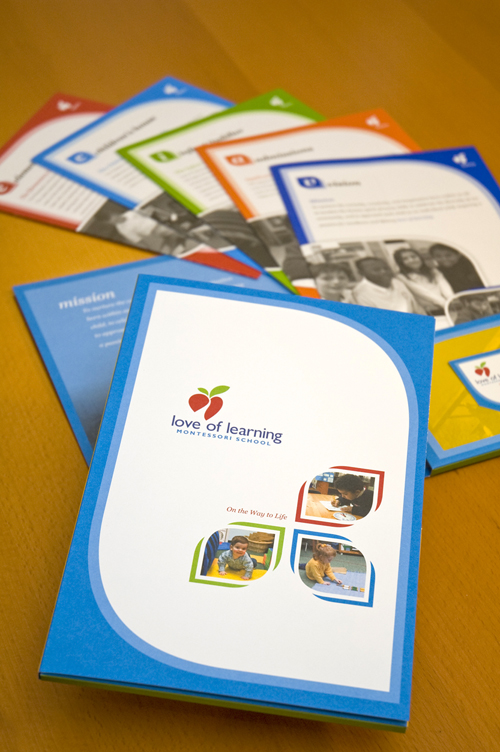
- A more unified school brochure/enrollment kit was created that prospective families would actually want to hold on to. The information was presented in a more organized and consistent manner. Photography of real students in the real environment was introduced. This approach connected with parents and allowed prospective students to identify with children in the photographs.
- Stationary package incorporating new look and feel so all correspondence is consistent.
Download the case study PDF HERE


