Guest post by Monica Crowe
You want to tell the world about your business. Your website home page is full of the important facts people need to know, and other pages on the site are just as detailed. But, somehow, your website rarely results in phone calls or e-mails from new leads.
As a copywriter, this is a common complaint I hear from new clients and business acquaintances. As long as you know your audience (and their hot-button needs), and can articulate them in writing, you’re all set. You have one foot on the path to getting regular leads and sales from your website. Best of all, it only takes a couple of simple adjustments to make it happen.
Three Tweaks for Website Lead Generation
STEP ONE
Clean up the text on your page. When it comes to writing, most people believe more is better. But just the opposite is true – especially on the Internet – where people tend to scan, rather than read word for word.
Give readers necessary information in bite sized, easy to digest segments. This begins with simple, clear writing. But don’t mistake simple for bland. You won’t have to sacrifice personality. Instead, you’ll eliminate unnecessary words and phrases, and replace them with powerful adjectives to keep the text popping with interest.
STEP TWO
Big blocks of text make a page awfully dull and gray. Our eyes like white space. Give your newly clarified web copy room to breathe. Use line breaks every three to four sentences. Bold key phrases (not entire sentences). Use large headings and sub headings for visual impact, and even to highlight an important point.
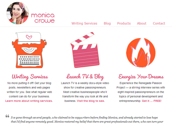
My favorite trick for creating white space, while delivering bite sized information, is to segment text into columns. Place an image that communicates a key idea above each column. (See example below) Write two to three sentences in each column that reinforce and expand on the idea of the image.
This works especially well on a website home page. It gives readers just enough information to know whether or not your product or service is what they’re looking for. If it is, they’ll dig further into your website for more information. Hence, it’s not necessary to clog your home page with every point you want to make. Save some details for your “About” and “Services/Products” pages.
STEP THREE
Whether or not your page has columns, use professional quality photos to communicate, and to support your writing. A person who teaches adult art classes might describe the classroom environment and leave it at that. It’s adequate, but a photo of the teacher instructing a student at her easel would bring the idea to life. Suddenly, the teacher and her classroom are more real and desirable to the reader.
What you write on your website is important, no doubt. But the visual style, and how you format the text, are just as important. Pair these two, and you’ll get a flurry of calls and e-mails in no time.
About the Author


