Deciphering Designer Jargon
As a designer, there are a host of terms that are unique to my profession. I forget that my clients may not know what I am talking about at times because it is just second-nature to me. This is usually evident when I get the “deer in the headlights” look from them or receive an uncomfortable silence from them on the phone. I have to remind myself that I need to take that into consideration when discussing projects. There are many clients who are already savvy since they have been in my industry in one way or another. Then there are the clients who just don’t know and that’s okay. It’s part of my job as a designer to educate my clients and this list is for them and anyone else who cares to know. I think it is important to have clear communication with your clients on all levels. It makes for a better product and a better relationship, because in the end, we build relationships with our clients.
Here are the 11 terms that I get asked about most often.
- Leading – In paragraphs, this is the spacing between the lines of text – most commonly measured in points (pts)(red lines in figure below). On Web pages, this is also referred to as Line Spacing or line height.
- Kerning – In text, this is the spacing between the letters. (blue lines in figure below) Also measured in pts. the higher the value, the more spacing there is between letter. Sometimes you will see exaggerated kerning as a design element, say maybe in a title, but typically, you don’t want to have too much or too little. Both Kerning and leading are fundamentals of typography.
- FPO – This is simply an acronym for “For Placement Only”. Mostly used for print design projects, but not limited to them. Usually the letters FPO in a bright color (I use magenta) are placed over an image that is used as a place holder or even blocks of text, or any element for that matter. It ensures that the job doesn’t go to press with the wrong image or information that is used only as a placeholder.
- Gutter – This refers to the vertical space between columns of text/images as well as the space between page spreads. (Spreads refers to facing pages)
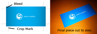
- Bleed – When a print piece “bleeds” it means that the ink goes all the way to the edge of the finished piece. It’s called a Bleed because the piece (lets use a postcard for this example) is printed on a larger piece of paper and the design is actually larger than the finished piece. Then the card is cut down using special machinery according to Crop Marks (see next term) to denote where the cuts are made.
- Crop marks – Little thin-lined hash marks that are used to denote the edge of the piece as well as where the pice will be cut down. the crop marks are printed but are eventually cut away.
- Crop – This refers to omitting a portion of an image or photograph. For instance if there was an image of 2 people and you wanted only one person in the image, you would “crop out” the person you didn’t want in the image.
- DPI/Low Res/ High Res – This topic can really take up an entire blog post which I will refrain from today. Just know that DPI stands for Dots Per Inch and refers to the resolution of the image (raster images such as photographs) Typically if an image is Low resolution it will have a low DPI. Conversely, images are considered High resolution if the DPI is higher. Now there are other factors that may make some of that untrue. I’ll save that for another day.
- White Space refers to any area of a design that doesn’t have anything there. Its blank. Sometimes there is a tendency to want to always fill that white space by making an item bigger. this is not always a great idea. White space can be your friend!
- Negative space is the space that is created by 1one or more object. For instance, a famous example would be the arrow that is created with the negative space between the “e” and the “x” in the Fedex logo.
- PMS – WHAT! That’s right. We encounter a LOT of PMS in this industry. PMS actually stands for Pantone Matching System. It is a color system (also referred to as Pantone colors) that was designed to maintain a consistent standard or reproduction across any print medium. The colors or inks are made with proprietary formulas so that no matter where you get your project printed, if a PMS color was specified, it should look the same. Some larger corporations have actually had their own proprietary PMS color made for their brand. FedEx and Coke are just a couple.
There are plenty more as there are with any industry. What are some other terms that you have heard that made you say “huh?”


